Welcome to Inflationary Depression
There was an oblique message buried in a recent New York Times story on the growing crisis in commercial real estate in cities.
Yes, this is exactly the kind of article that people pass over because it seems like it doesn’t have broad application. In fact, it does.
It affects the core of issues like our city skylines, how we think about urbanism and progress, where we vacation and work and whether the big cities are drivers or drains on national productivity.
The note mentions the “broader distress brewing in the commercial real estate market, which is hurting from the twin punches of high interest rates, which make it harder to refinance loans, and low occupancy rates for office buildings — an outcome of the pandemic.”
The consequences will echo long into the future. The high interest rates are a result of trying to slow down the money spigot unleashed in March 2020, in which more than $6 trillion in new cash appeared out of nowhere and was distributed as if by helicopter.
What did the money injection do? It generated inflation. How much? Sadly, we don’t know.
Is the True Inflation Rate 19%?
The Bureau of Labor Statistics simply cannot keep up, partially because the Consumer Price Index does not calculate the following: interest on anything, taxes, housing, health insurance (accurately), homeowners insurance, car insurance, government services like public schools, shrinkflation, quality declines, substitutions due to price or additional service fees.
Those are a major part of what has gone up, which is why data on particular industries show a huge gap (groceries up 35% over four years) and why ShadowStats estimates inflation in double digits two years running, having peaked at 17%. Just adding in interest, a paper from NBER estimates, takes 2023 inflation to 19%.
Various studies have shown that since 2019 fast-food prices — a gold standard in financial markets for measuring true inflation — have outpaced official CPI by 25–50%.
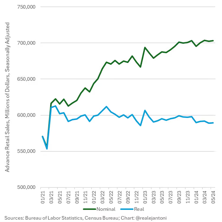
Getting the inflation data wrong is only the start of the problem. We’re lucky if any government data even adjusts for the wrong numbers. Consider retail sales as just one example.
Let’s say you bought a hamburger last year for $10 and you bought one this week for $15. Would you say that your retail spending is up 50%? No, you just spent more on the same thing. Well, guess what? All retail sales are calculated this way.
Get Real
It’s the same with factory orders. You have to do the inflation adjustments yourself. Even using conventional data, which are wildly underestimated, wipes out all gains of the last several years. E.J. Antoni is one of the few economists actually keeping up with this stuff, and he produces the following two charts.
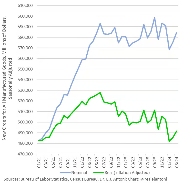
As E.J. writes: “This is factory orders before and after adjusting for inflation: What looks like a 21.1% increase from Jan ’21 to March ’24 is only a 1.8% increase — the rest is just higher prices, not more physical stuff; worse yet, real orders are down 6.9% since their high-water mark in June ’22.”
Imagine the same charts but with more realistic adjustments. Are you getting the picture? The mainstream data being dished out daily by the business press is fake. And imagine the same charts above redone with inflation in the double digits as it should be.
We’ve got a serious problem.
More Lies
The problems with the employment data are getting to be more well-known. Essentially, the establishment data that is normally reported is double-counting or just plain inaccurate, and there is a huge divergence with the other method of counting jobs via household surveys. E.J. again offers this look.
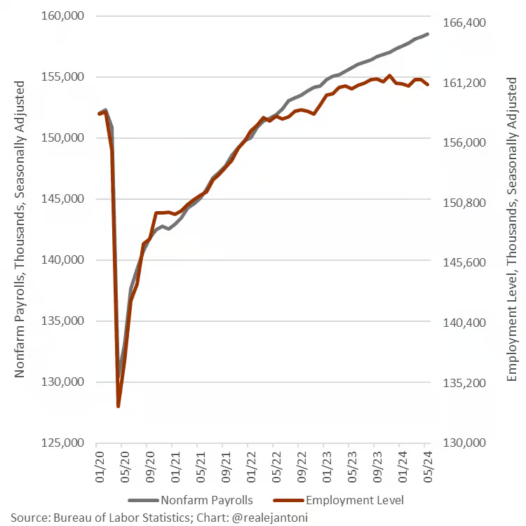
In addition, neither worker/population ratios nor the labor participation rate is back to pre-lockdown levels.
We Never Left the Recession of 2020
Now consider GDP. In the old formula hammered out in the 1930s, government spending adds to the GDP while cuts subtract from it, just as exports add and imports subtract. Why? It’s an old theory rooted in a kind of Keynesian/mercantilism that no one seems ever to change. But the bias is profound these days with explosive government spending.
To calculate whether and to what extent we are in recession, we look not at nominal GDP but real GDP. That is, adjusted for inflation. Two down quarters are considered recessionary. What if we adjust pathetic and seriously misestimated output numbers by a realistic understanding of inflation over the last few years?
We don’t have the numbers but a back-of-the-envelope suggests that we never left the recession of March 2020 and that everything has been getting gradually worse.
That appears to fit with every single consumer sentiment survey. It seems likely that people themselves are better observers of reality than government data collectors and statisticians.
Savings Rates and Credit Card Debt Have Flipped
So far, we’ve dealt briefly with inflation, sales and output, and find that none of the official data is reliable. One mistake bleeds to others, such as adjusting output for inflation or adjusting sales for increased prices. The jobs data is particularly problematic because of the problem of double-counting.
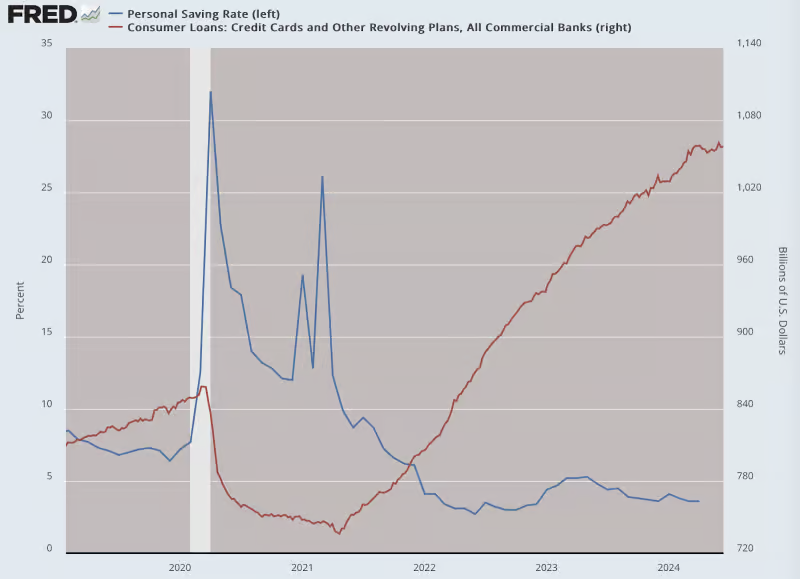
What to know about household finance? The flipping of savings rates and credit card debt tells the story.
Nothing We’re Being Told Is Real
When you add it all up, you get a strange sense that nothing we’re being told is real. According to official data, the dollar has lost about 23 cents in purchasing power over the last four years. Absolutely no one believes this.
Depending on what you actually spend money on, the real answer is closer to 35 cents or 50 cents or even 75 cents… or more. We don’t know what we cannot know.
We’re just left to speculate. And this problem is combined with the reality that this is not just a U.S. problem. The increase in inflation and the decline in output is truly global. We might call this an inflationary recession or high inflationary depression, all over the world.
Consider that most economic models used through the 1970s, and still today, postulate that there is a forever trade-off between output (with employment as a proxy) and inflation, such that when one is up, the other is down (Phillips curve).
Now we face a situation where the jobs data are profoundly affected by bad surveys and labor dropouts, output data is distorted by history-making levels of government spending and debt and no one is even trying anymore to provide a realistic accounting of inflation.
We’re More Blind Than Ever
What the heck is really going on? We live in data-obsessed times with seemingly magical abilities to know and calculate everything. And yet even now, we seem to be more blind than ever before. The difference is that nowadays, we are supposed to trust and rely on data that no one even believes is real.
Going back to that commercial real estate crisis, for the New York Times story, the large banks would not even talk to the reporters doing the story. That should tell you something.
We live with a don’t-ask-don’t-tell economy. No one wants to say “high inflation.” No one wants to say “economic depression.” Above all else, never admit the truth: The turning point in our lives and the precipitating event to the whole calamity for the world were the lockdowns themselves.
All else follows.


Comments: